which we would call a space curve. All alphabets
will space along the same line providing for the
purposes of our instrument they have the same
height. The line can be raised or lowered in parallel to
correspond with the minimum fit of the most
asymmetrical letter with the smallest value, generally
the capital 'L'.
As stated above we can now space alphabets by eye
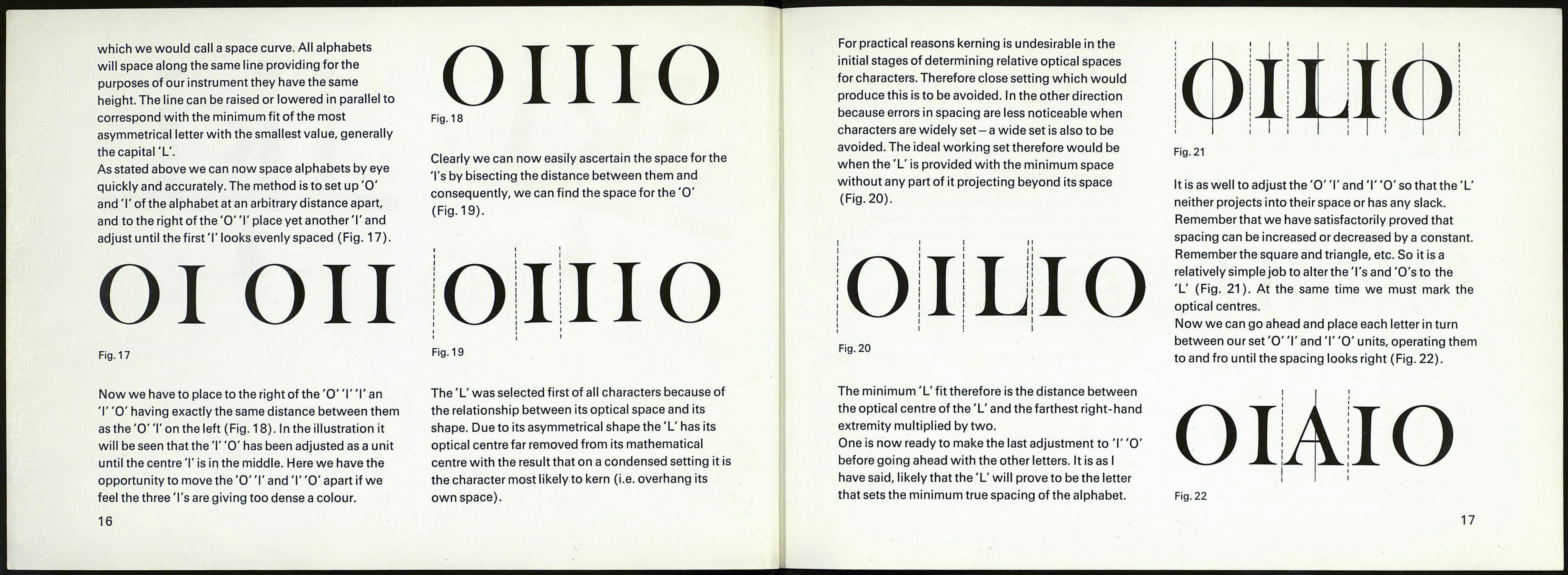
quickly and accurately. The method is to set up 'O'
and T of the alphabet at an arbitrary distance apart,
and to the right of the 'O' T place yet another T and
adjust until the first'I'looks evenly spaced (Fig. 17).
Ol on
Fig. 17
Now we have to place to the right of the 'O' T T an
T 'O' having exactly the same distance between them
as the 'O' T on the left (Fig. 18). In the illustration it
will be seen that the T 'O' has been adjusted as a unit
until the centre T is in the middle. Here we have the
opportunity to move the 'O'T and T 'O' apart if we
feel the three T's are giving too dense a colour.
16
OHIO
Fig. 18
Clearly we can now easily ascertain the space for the
Ts by bisecting the distance between them and
consequently, we can find the space for the 'O'
(Fig. 19).
: ! !
Fig. 19
The 'L' was selected first of all characters because of
the relationship between its optical space and its
shape. Due to its asymmetrical shape the 'L' has its
optical centre far removed from its mathematical
centre with the result that on a condensed setting it is
the character most likely to kern (i.e. overhang its
own space).
For practical reasons kerning is undesirable in the
initial stages of determining relative optical spaces
for characters. Therefore close setting which would
produce this is to be avoided. In the other direction
because errors in spacing are less noticeable when
characters are widely set - a wide set is also to be
avoided. The ideal working set therefore would be
when the 'L' is provided with the minimum space
without any part of it projecting beyond its space
(Fig. 20).
I I M
1 I I I
Fig. 20
The minimum 'L' fit therefore is the distance between
the optical centre of the 'L' and the farthest right-hand
extremity multiplied by two.
One is now ready to make the last adjustment to T 'O'
before going ahead with the other letters. It is as I
have said, likely that the 'L' will prove to be the letter
that sets the minimum true spacing of the alphabet.
Fig. 21
It is as well to adjust the 'O' T and T 'O' so that the 'L'
neither projects into their space or has any slack.
Remember that we have satisfactorily proved that
spacing can be increased or decreased by a constant.
Rememberthe square and triangle, etc. So it is a
relatively simple job to alter the Ts and 'O'sto the
'L' (Fig. 21). At the same time we must mark the
optical centres.
Now we can go ahead and place each letter in turn
between our set 'O' T and T 'O' units, operating them
to and fro until the spacing looks right (Fig. 22).
Fig. 22
17
