32 Art in the Alphabet.
That is the pen-born shape. The even-sided О
was, if not easier to cut in stone, at least as easy ;
there was nothing to prevent symmetry, which
was accordingly the rule in sculpture. It is rather
futile to aim at that kind of thing with a pen ;
much better let the pen have its way ; and its way
is otherwise (176, 179). We get so much more out
of our tools by going with them, that it is rather
stupid to strive against them.
In very bold writing, even with a pen, the
necessity for truncating the thick strokes occurs.
You cannot easily, with one stroke of the pen,
make a thick line which begins and ends square.
It wants trimming ; and the easiest way to trim
it is by means of a fine cross-stroke extending
beyond its width. This cross-stroke T helps to
preserve and to accentuate the regularity of the
line of lettering, for which a writer worth the name
naturally has a care. The broad stroke being
rather loaded with ink, the fine cross-stroke is
inclined, in crossing it, to drag a little of the ink
with it, rounding one angle of it. The obvious
way of rectifying that is to round the opposite
angle also—and so we have the familiar finish T,
which is equivalent to the " spur " of the chiseller
mentioned just now (208).
The angle at which the cross-line joins the
stroke may be softened until it disappears, and
the stroke appears to be curved on either side—
" dilates," to use another accepted term, at the
Art in the Alphabet.
33
jes
"а
шпоіВіміівп
□□ODnODOODDa
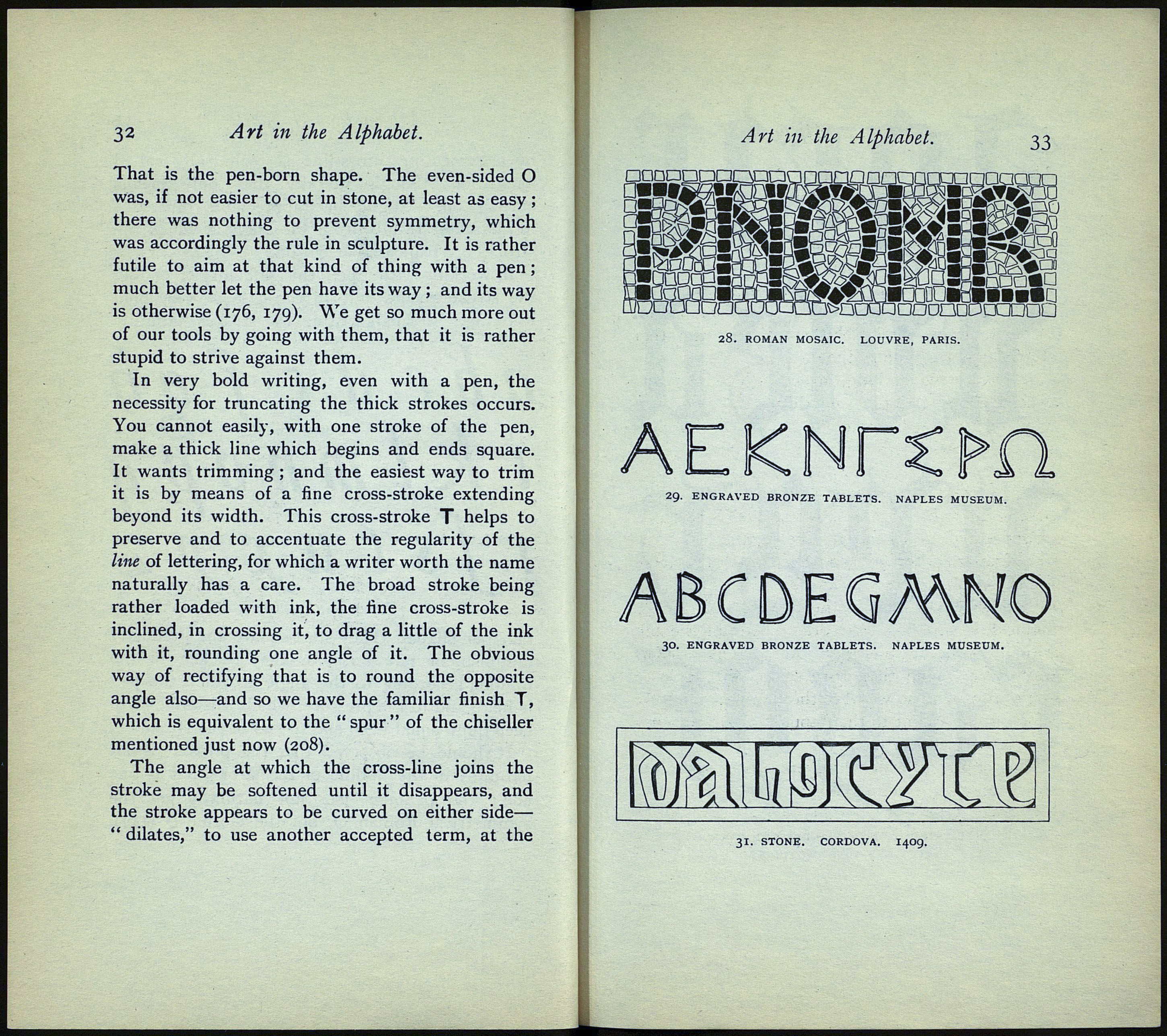
28. ROMAN MOSAIC. LOUVRE, PARIS.
EKN
lì (i
29. ENGRAVED BRONZE TABLETS. NAPLES MUSEUJ
CDEGMNO
30. ENGRAVED BRONZE TABLETS. NAPLES MUSEUM.
31. STONE. CORDOVA. 1409.
