Зо
Art in the Alphabet.
Even in late Gothic lettering we find a minus¬
cule which is of the pen (23), and another (24, 25)
which is monumental, adapted, that is to say, to
precise and characteristic rendering with the graver
upon sheets of brass. It is curious that out of this
severe form of writing the florid ribbon character
(108) should have been evolved. But when once
the engraver began to consider the broad strokes of
his letters as bands or straps, which, by a cut of
the graver, could be made to turn over at the ends,
as indicated in Alphabet 125, it was inevitable
that a taste for the florid should lead him to
something of the kind. The wielder of the brush
was in all times induced by his implement to make
flourishes (32, 33), in which the carver had much
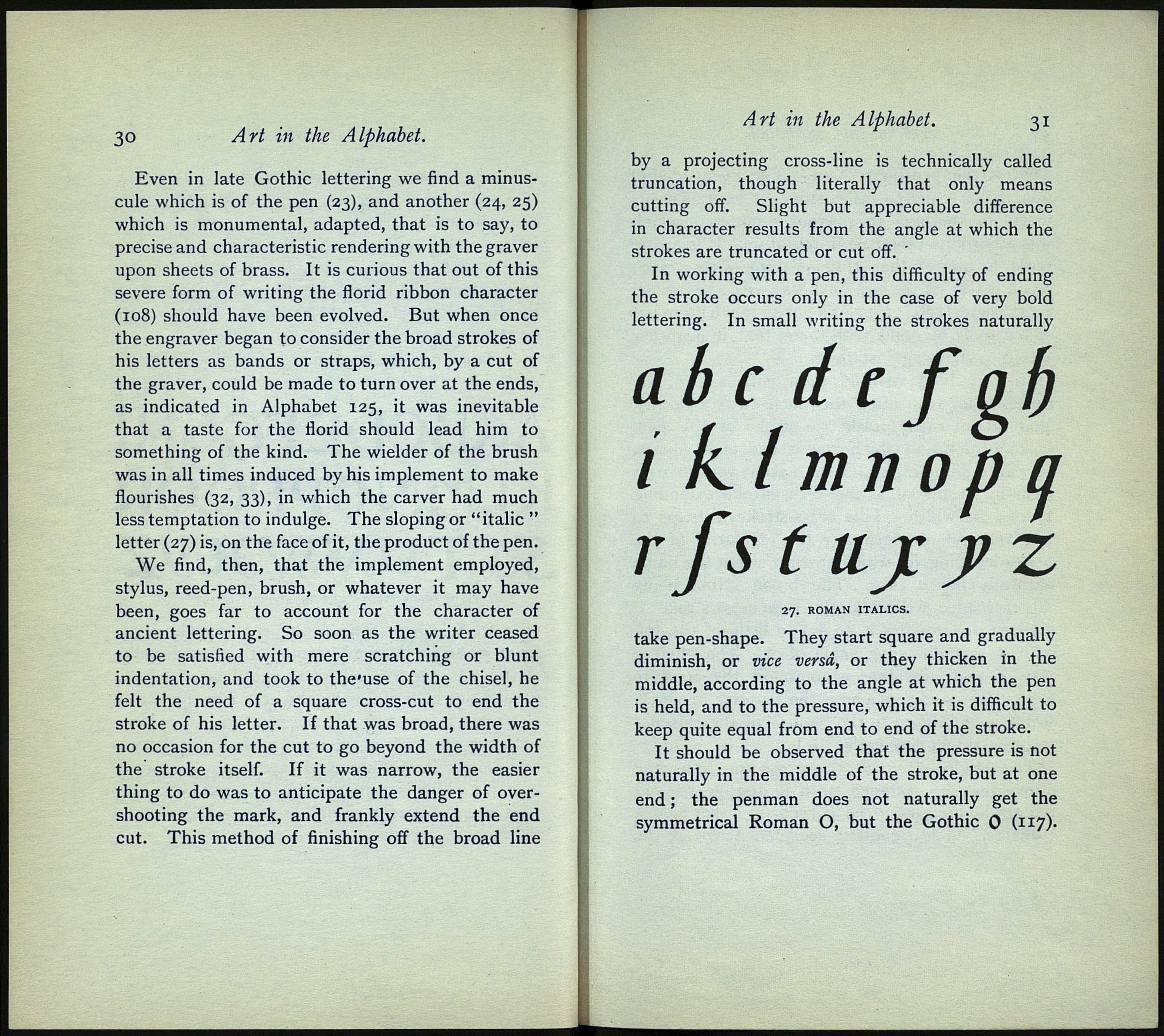
less temptation to indulge. The sloping or "italic "
letter (27) is, on the face of it, the product of the pen.
We find, then, that the implement employed,
stylus, reed-pen, brush, or whatever it may have
been, goes far to account for the character of
ancient lettering. So soon as the writer ceased
to be satisfied with mere scratching or blunt
indentation, and took to the'use of the chisel, he
felt the need of a square cross-cut to end the
stroke of his letter. If that was broad, there was
no occasion for the cut to go beyond the width of
the stroke itself. If it was narrow, the easier
thing to do was to anticipate the danger of over¬
shooting the mark, and frankly extend the end
cut. This method of finishing off the broad line
Art in the Alphabet. 31
by a projecting cross-line is technically called
truncation, though literally that only means
cutting off. Slight but appreciable difference
in character results from the angle at which the
strokes are truncated or cut off.
In working with a pen, this difficulty of ending
the stroke occurs only in the case of very bold
lettering. In small writing the strokes naturally
ab с dс f gb
i klmnopa
rfs t ujc j?z
27. ROMAN ITALICS.
take pen-shape. They start square and gradually
diminish, or vice versa, or they thicken in the
middle, according to the angle at which the pen
is held, and to the pressure, which it is difficult to
keep quite equal from end to end of the stroke.
It should be observed that the pressure is not
naturally in the middle of the stroke, but at one
end ; the penman does not naturally get the
symmetrical Roman O, but the Gothic 0 (117)-
