24 Art in the Alphabet.
a6ci>cfg(H
fimnopqn
fsíupn>rp¿
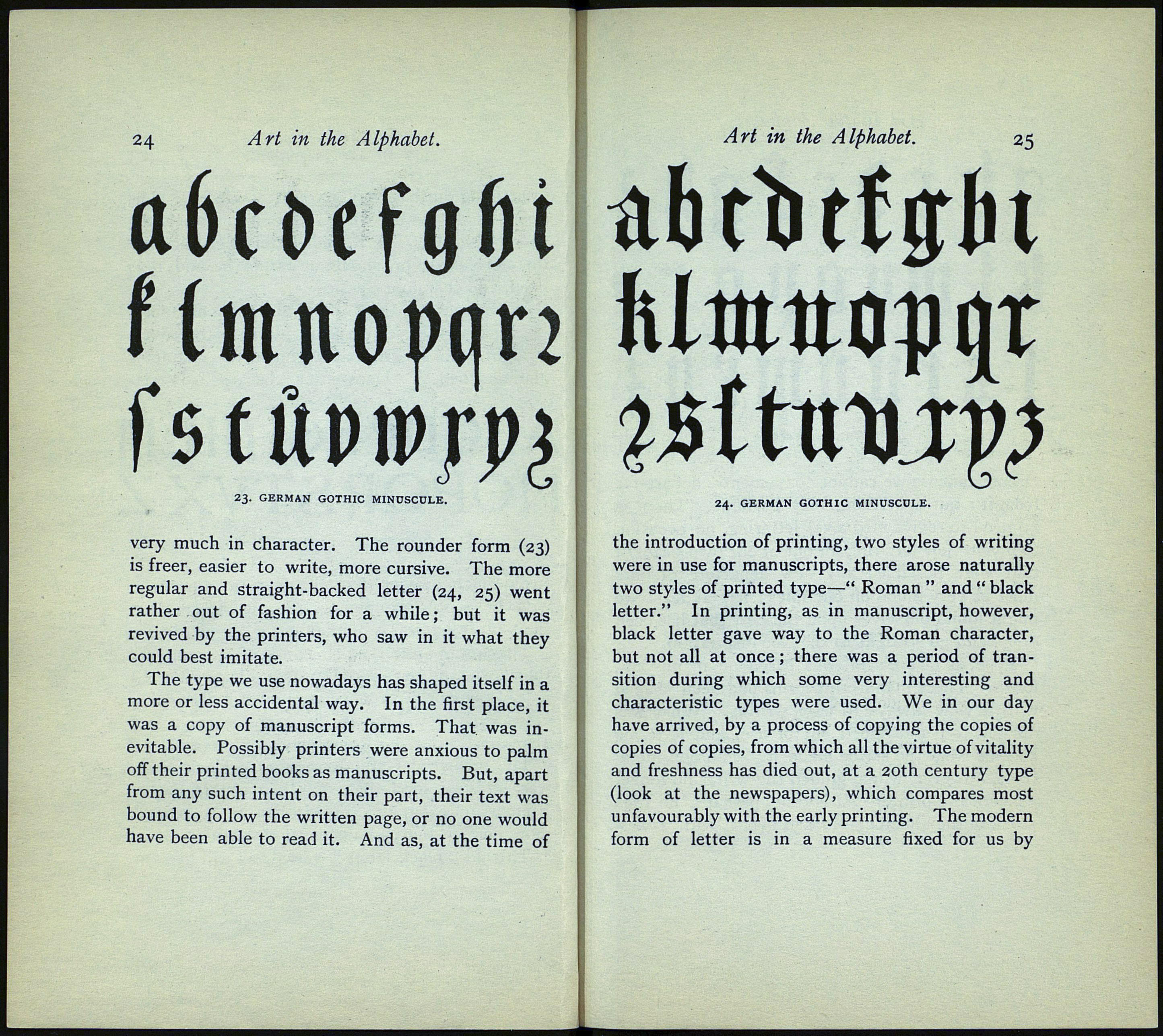
23. GERMAN GOTHIC MINUSCOLE.
very much in character. The rounder form (23)
is freer, easier to write, more cursive. The more
regular and straight-backed letter (24, 25) went
rather out of fashion for a while; but it was
revived by the printers, who saw in it what they
could best imitate.
The type we use nowadays has shaped itself in a
more or less accidental way. In the first place, it
was a copy of manuscript forms. That was in¬
evitable. Possibly printers were anxious to palm
off their printed books as manuscripts. But, apart
from any such intent on their part, their text was
bound to follow the written page, or no one would
have been able to read it. And as, at the time of
Art in the Alphabet.
25
ubcb tiffin
24. GERMAN GOTHIC MINUSCULE. ,
the introduction of printing, two styles of writing
were in use for manuscripts, there arose naturally
two styles of printed type—" Roman " and " black
letter." In printing, as in manuscript, however,
black letter gave way to the Roman character,
but not all at once ; there was a period of tran¬
sition during which some very interesting and
characteristic types were used. We in our day
have arrived, by a process of copying the copies of
copies of copies, from which all the virtue of vitality
and freshness has died out, at a 20th century type
(look at the newspapers), which compares most
unfavourably with the early printing. The modern
form of letter is in a measure fixed for us by
