22 Art in the Alphabet.
inscriptions were commonly written in minuscule
letters. In many cases these Lombard capitals
were not written with a pen, but with a brush, from
which results something of their character. The
brush lines were fatter than pen strokes.
Gothic characteristics, however, only gradually
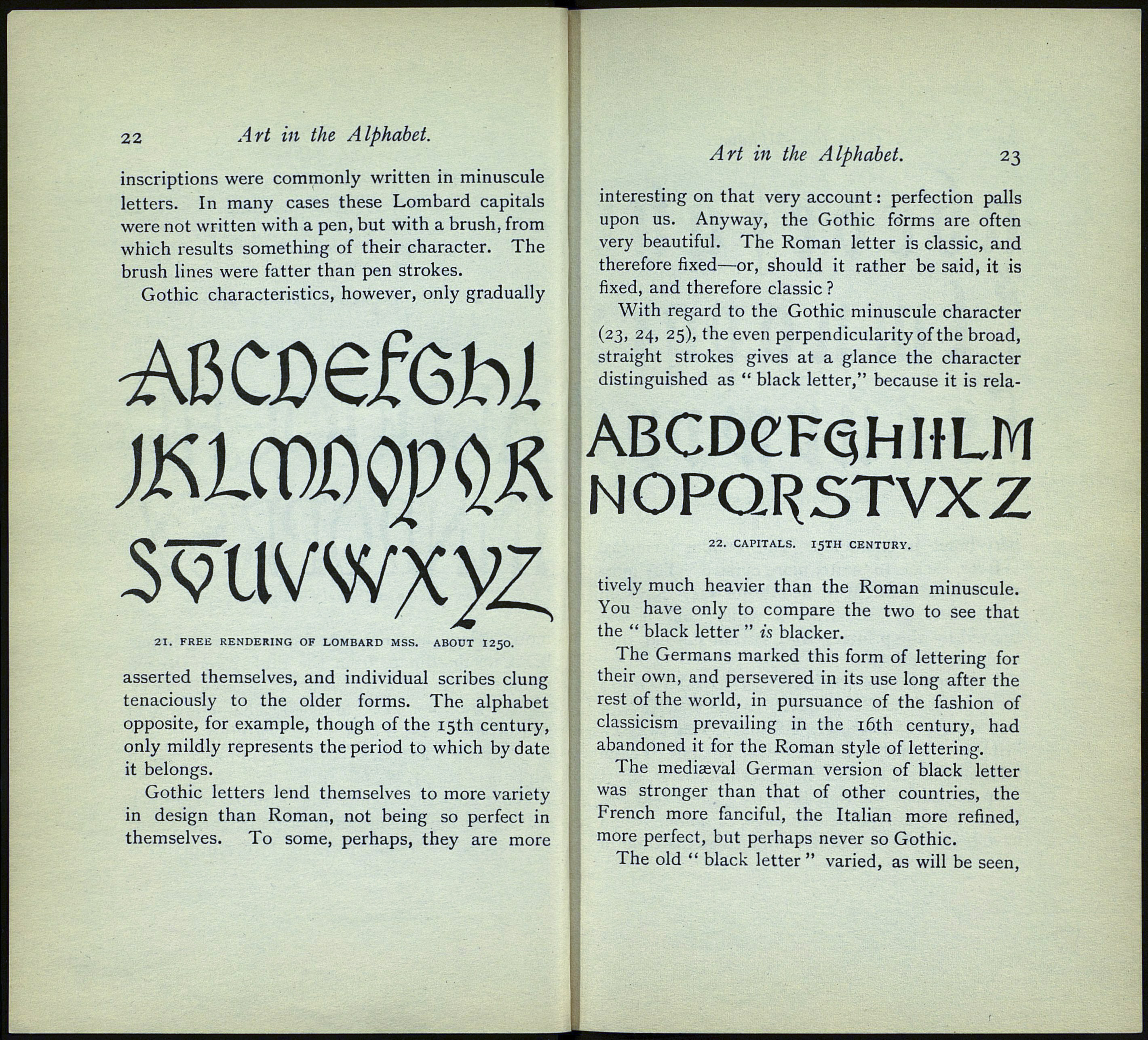
ABcx>efôbi
21. FREE RENDERING OF LOMBARD MSS. ABOUT I250.
asserted themselves, and individual scribes clung
tenaciously to the older forms. The alphabet
opposite, for example, though of the 15th century,
only mildly represents the period to which by date
it belongs.
Gothic letters lend themselves to more variety
in design than Roman, not being so perfect in
themselves. To some, perhaps, they are more
Art in the Alphabet. 23
interesting on that very account : perfection palls
upon us. Anyway, the Gothic forms are often
very beautiful. The Roman letter is classic, and
therefore fixed—or, should it rather be said, it is
fixed, and therefore classic ?
With regard to the Gothic minuscule character
(23, 24, 25), the even perpendicularity of the broad,
straight strokes gives at a glance the character
distinguished as " black letter," because it is rela-
ABCDeFQhHLM
NOPQRSTVXZ
22. CAPITALS. 15TH CENTURY.
tively much heavier than the Roman minuscule.
You have only to compare the two to see that
the " black letter " is blacker.
The Germans marked this form of lettering for
their own, and persevered in its use long after the
rest of the world, in pursuance of the fashion of
classicism prevailing in the 16th century, had
abandoned it for the Roman style of lettering.
The mediaeval German version of black letter
was stronger than that of other countries, the
French more fanciful, the Italian more refined,
more perfect, but perhaps never so Gothic.
The old " black letter " varied, as will be seen,
