го Art in the Alphabet.
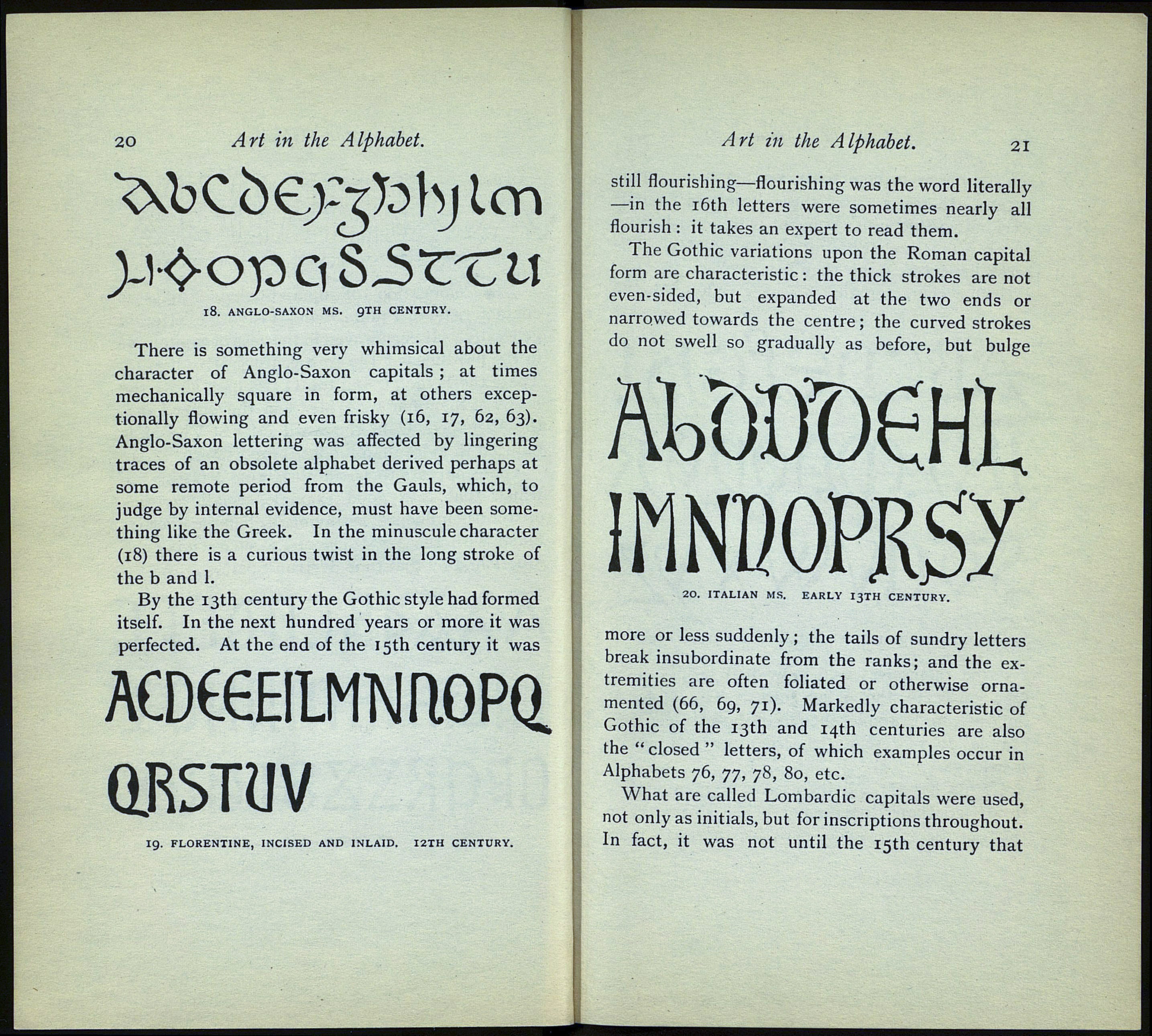
There is something very whimsical about the
character of Anglo-Saxon capitals ; at times
mechanically square in form, at others excep¬
tionally flowing and even frisky (16, 17, 62, 63).
Anglo-Saxon lettering was affected by lingering
traces of an obsolete alphabet derived perhaps at
some remote period from the Gauls, which, to
judge by internal evidence, must have been some¬
thing like the Greek. In the minuscule character
(18) there is a curious twist in the long stroke of
the b and 1.
By the 13th century the Gothic style had formed
itself. In the next hundred years or more it was
perfected. At the end of the 15th century it was
ACDÉŒILMNriOPQ.
QKSTUV
19. FLORENTINE, INCISED AND INLAID. I2TH CENTURY.
Art in the Alphabet. 21
still flourishing—flourishing was the word literally
—in the 16th letters were sometimes nearly all
flourish : it takes an expert to read them.
The Gothic variations upon the Roman capital
form are characteristic : the thick strokes are not
even-sided, but expanded at the two ends or
narrowed towards the centre ; the curved strokes
do not swell so gradually as before, but bulge
АШЮѲІ
ІГШОРКЗУ
20. ITALIAN MS. EARLY I3TH CENTURY.
more or less suddenly ; the tails of sundry letters
break insubordinate from the ranks; and the ex¬
tremities are often foliated or otherwise orna¬
mented (66, 69, 71). Markedly characteristic of
Gothic of the 13th and 14th centuries are also
the " closed " letters, of which examples occur in
Alphabets 76, 77, 78, 80, etc.
What are called Lombardie capitals were used,
not only as initials, but for inscriptions throughout.
In fact, it was not until the 15th century that
18. ANGLO-SAXON MS. 9TH CENTURY.
