18 Art in the Alphabet.
after him) did not yet manage to fashion very
satisfactory capitals. They still mixed up letters
all of one thickness with others in which thick and
thin strokes, or diminishing strokes, were used in a
most illogical and awkward way (64)—indicative, of
course, of a period of change. But they did arrive
at a satisfactory and very characteristic rendering
TI
HEBT ОКБ
Ш
/
Ж DK,
/ т
eXPRMÍTVRÍiVMlk
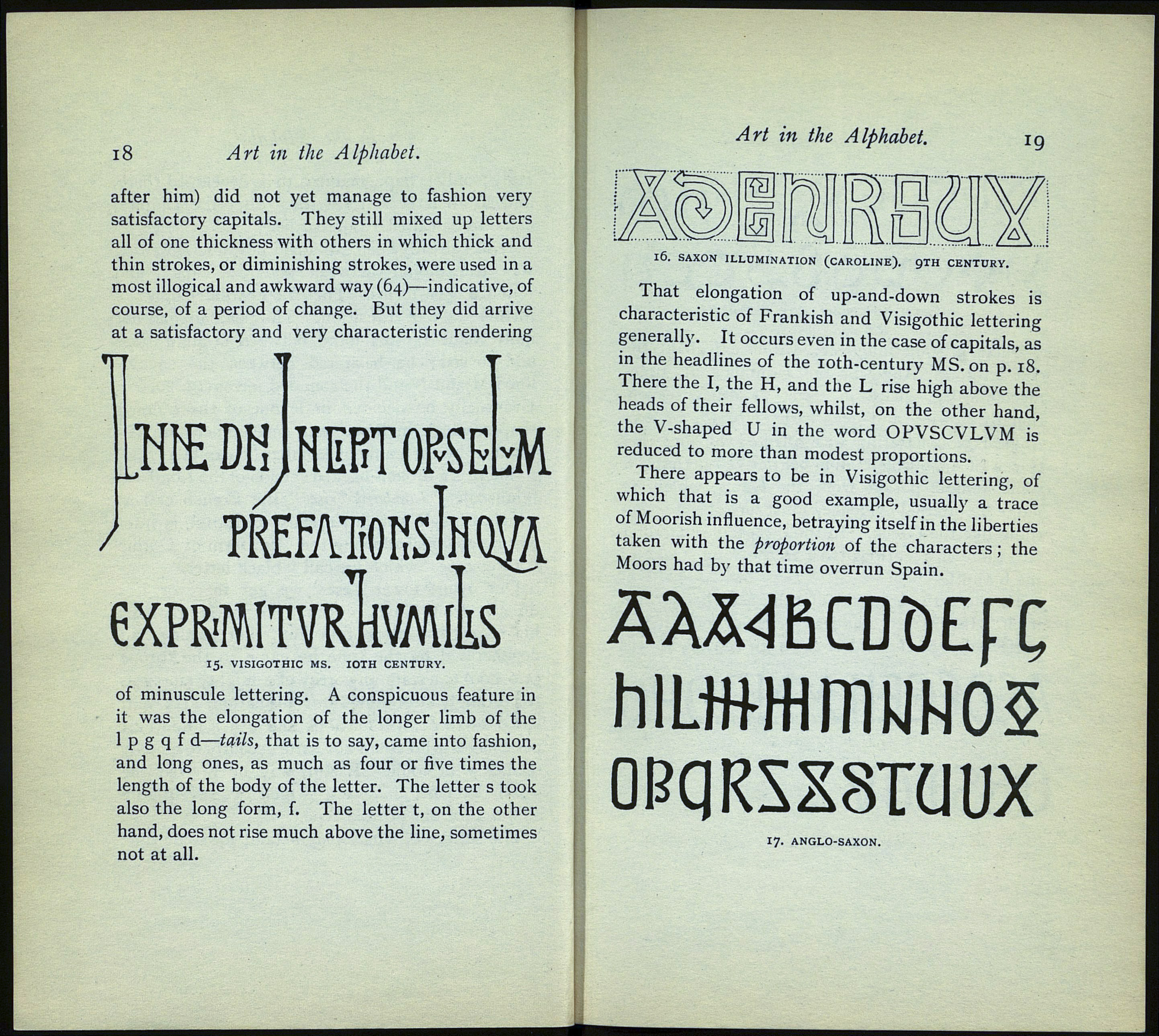
15. VISIGOTHIC MS. IOTH CENTURY.
of minuscule lettering. A conspicuous feature in
it was the elongation of the longer limb of the
1 p g q f d—tails, that is to say, came into fashion,
and long ones, as much as four or five times the
length of the body of the letter. The letter s took
also the long form, f. The letter t, on the other
hand, does not rise much above the line, sometimes
not at all.
Art in the Alphabet. ig
>. SAXON ILLUMINATION (CAROLINE). 9TH CENTURY.
That elongation of up-and-down strokes is
characteristic of Frankish and Visigothic lettering
generally. It occurs even in the case of capitals, as
in the headlines of the 10th-century MS. on p. 18.
There the I, the H, and the L rise high above the
heads of their fellows, whilst, on the other hand,
the V-shaped U in the word OPVSCVLVM is'
reduced to more than modest proportions.
There appears to be in Visigothic lettering, of
which that is a good example, usually a trace
of Moorish influence, betraying itself in the liberties
taken with the proportion of the characters ; the
Moors had by that time overrun Spain.
'ÄAÄ4BCDUEFX
hlLtfrHimUNOS
OPqRSXSTÜUX
17. ANGLO-SAXON.
