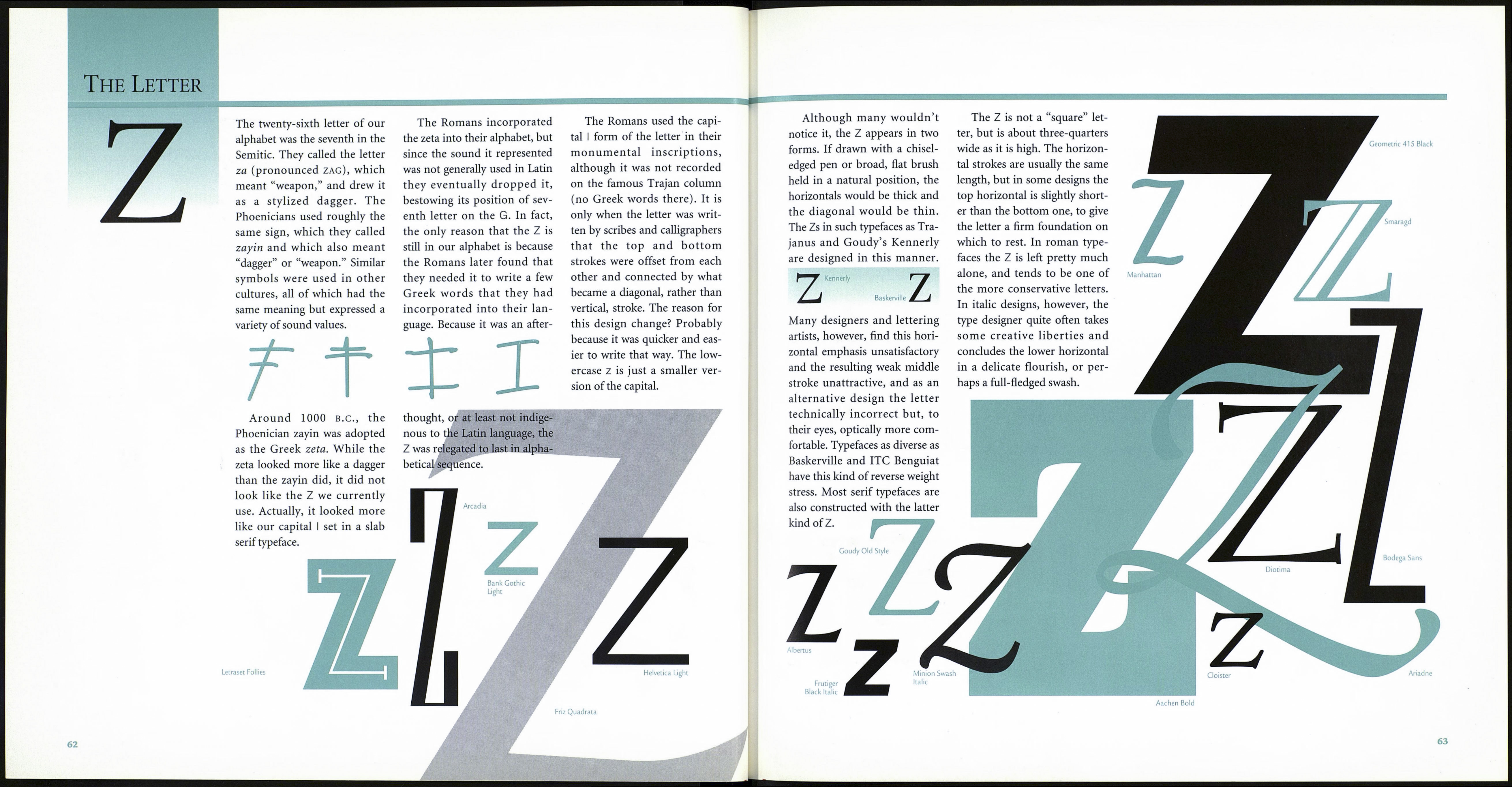
The Letter
X
Seri fa
cT
Adobe Caslon Swash Italic
Futura Extra Bold
Some could contend that our X
is unnecessary. Fewer words in
the English language start with
the X than with any other let¬
ter, and its sound value is
duplicated by both the z and
the ks combination. The Phoe¬
nicians had no use for the x
sound, many scholars contend
that the Greeks didn’t use the
letter to represent a phonetic
sound, and the Romans, who
weren’t exactly sure where to
use it, stuck it at the end of
their alphabet.
The Phoenician
ancestor to our X was
a letter called samekh,
which meant “fish.”
Although some histo¬
rians contend that the charac¬
ter instead represented a post
or support, with only a slight
stretch of the imagination it
perhaps could be seen as the
skeleton of a fish that has been
suspended vertically.
As it turns out, the sound
value of the samekh was not the
same as our current X’s. When
the Greeks adopted the Phoeni¬
cian alphabet, it seems that they
had no need for all the charac¬
ters representing sibilant
sounds, so they acquired or
modified only those that repre¬
sented the sounds they used.
The three Phoenician sound
values that were difficult for the
Greeks to pronounce (or
assume as equivalents) were the
shin, which represented the sh
sound; the tsade, which repre¬
sented the ts sound; and the
ancestor of our X, the samekh,
which represented the sharp s
sound. Because none of the
Phoenician letters represented
the soft s that was predominant
in their various dialects, the
Greeks chose letters that repre¬
sented the sound values closest
to those they were familiar with
and modified them slightly. For
example, while the western
(Chalcidian) Greeks chose the
tsade, renamed it san, and
attached to it the sound value
of ts, the eastern (Ionic) Greeks
adopted the shin, called it
sigma, and attributed to it the
sound value of sh. The samekh
became the Greek xi, which
had different sound values in
the two Greek alphabets.
Inconsistencies in Greek
pronunciation and in the usage
of some letterforms was a
direct result of geographical
and political disunity. Of the
many dialects and variations in
letterform shape and sound
values, the two main alphabet
subgroups were the Ionic and
the Chalcidian. By 400 B.C., the
Ionic alphabet, which had been
officially sanctioned at Athens,
eventually became what is now
known as the classical Greek
alphabet. The Chalcidian
alphabet, the alphabet of sever¬
al western Greek colonies that
were subsequently established
in southern Italy, influenced
several Italian writing styles,
including Umbrian, Osean,
and Etruscan. Native Etruscan
politics, culture, and art devel¬
oped largely as a consequence
of the Greek colonization of
southern Italy, and although
the Etruscans eventually halted
subsequent Greek expansion
into northern Italy, they adopt¬
ed many of the Chalcidian
Greek customs and practices.
The Romans appropriated
the X sound from the xi of the
Chalcidian alphabet and repre¬
sented it with the chi of the
Ionic alphabet,
which consists of
two diagonally
crossed strokes.
This letter, which
was added to the Ionic alpha¬
bet around 500 B.C., became
the prototype for both the cap¬
ital and lowercase X we use to
this day.
■
If the X were designed as a
truly symmetrical letter, it
would appear to be upside
down. As with most letters the
X is constructed to appear
“correct,” when mathematical¬
ly it might not be.
The diagonal strokes of the
letter actually cross just slightly
above its true center, making
the upper part smaller than the
lower. This gives the character
a firm foundation on which to
stand, and helps the eye move
across the page. Another trick
designers use is to make the
outside serifs longer than those
on the inside of the character,
which also enhances the letter’s
stability and legibility.
In serif designs, the seven to
one o’clock stroke is lighter and
usually a little more oblique
than the other diagonal—
again, to make things look
“right,” which in the X’s case
means symmetrical. Finally,
the width of the X should be
only one-half to three-quarters
(at most) of its height. If an X
is too wide it will look ungainly
and arrest the smooth flow of
the reading process.
Although Xs are constructed
of only two diagonal strokes,
there is a surprising diversity in
their design. The X in ITC Zapf
ITC Zapf \/
Я Chancery
iS % Rusticana
Chancery, for example, would
never be confused with the X in
Rusticana, or with the X in ITC
Busorama.
Stencil
University Roman
Broadway
Extrabold
Kennedy
Letraset
Citation
/
Snell Roundhand
Letraset La Bamba
Letraset Heliotype
Berthold City
Medium
Hobo
61
-