The Letter
■■■
Over four thousand years ago,
just as today, people who
couldn’t write used a simple
cross to sign letters and formal
documents. The name of this
almost universal symbol even
meant “mark” or “sign.” It’s
easy to assume that what has
become a commonly accepted
notation denoting a signature
was the forerunner of our cur¬
rent X. Instead, what looked
like an X to ancient writers
actually gave birth to the
Roman T.
X+^tT
Around 1000 B.C., the Phoe¬
nicians and other Semitic
tribes were using a variety of
crossed forms to represent the
letter that they called taw. This
letter, one of the first recorded,
served two purposes: to repre¬
sent the t sound, and to pro¬
vide a mark with which those
who could not write might sign
their name to a document.
When the Greeks adopted
the taw for their alphabet ten
centuries later, they altered it
only slightly so that it looked
pretty much like our T does
today. The tau, as they called it,
was in turn passed on, virtually
unchanged, from the Greeks to
the Etruscans, and finally to
the Romans.
ПГ
Letraset J ■
Burlington j Ш
cr
^ ^ Adobe
Tiffany
Ш Ф
Нд1»Им Berthold City B|
ЩВВШВШШ ~ ' ' '' Medium Н
I I I
Corvinus Skyl
ir 35 Light
Calligraphic 810
T
Poetica Chancery II
Supplement
Copperplate Gothic 30
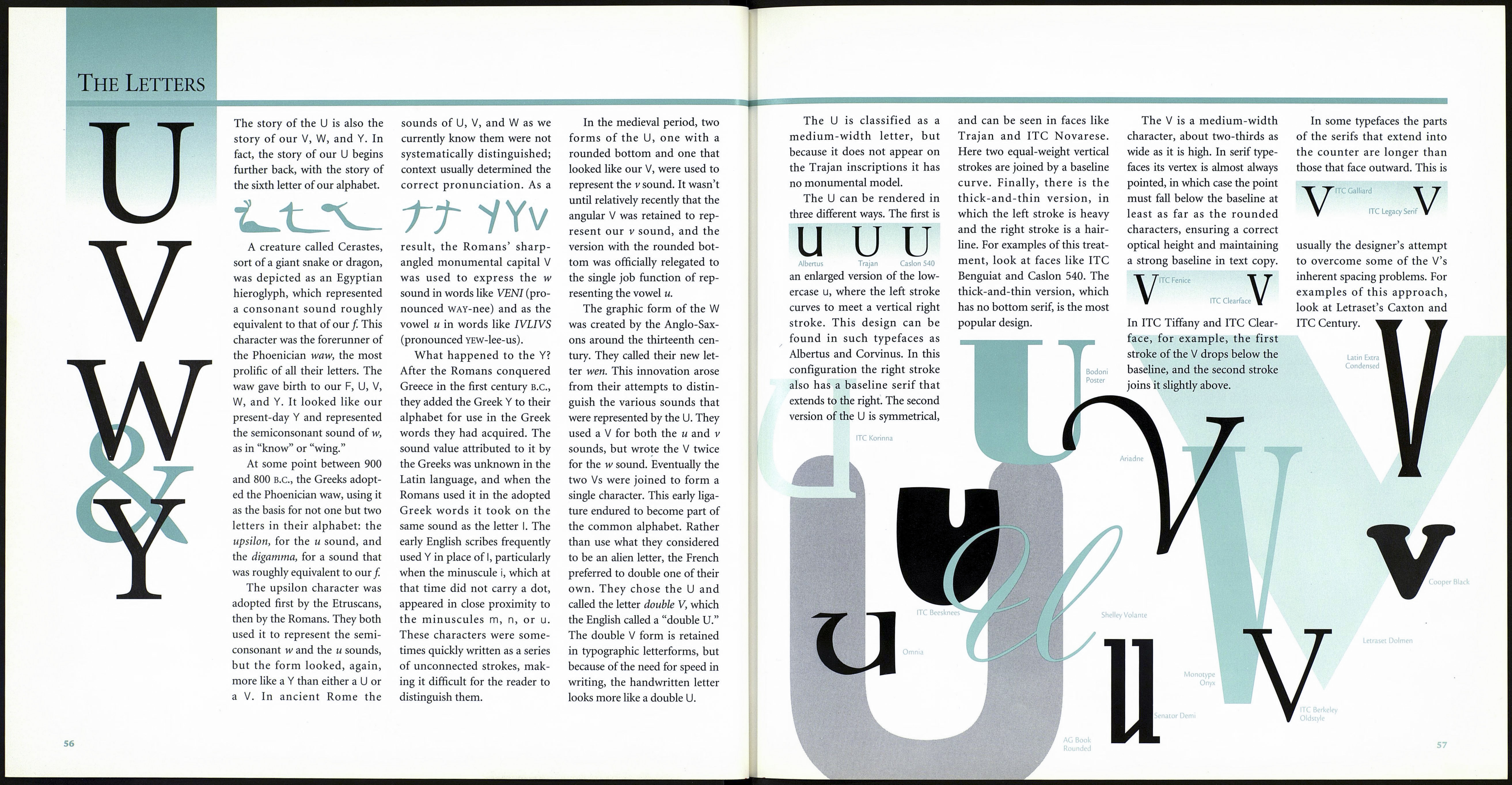
On the surface, the T ap¬
pears to be a very simple,
straightforward letter. In a
typeface like Helvetica or ITC
Avant Garde Gothic, it can be.
In many other faces, however,
type designers have shown that
the T leaves plenty of room for
artistic expression.
The T normally occupies
about two-thirds of an em
space, or about the same space
as the N or U. Its cross stroke
can be symmetrical, as in Cen¬
tury Old Style, or slightly longer
on one side, as in such calli¬
graphic designs as Hiroshige.
T Century Old Style
Hiroshige
The ends of the horizontal
cross stroke in roman types
may terminate with diagonally
structured serifs, as they do in
ITC Bookman or Caslon, or
strictly vertical ones, like those
in Bodoni. And sometimes the
T’s cross stroke serifs can be
vertical on one side and diago¬
nal on the other, as they are in
ITC Garamond.
T T T
ITC Bookman
In handlettering there is
even more leeway in the design
of the letter T. Its elements can
(and should) be adjusted so
that the character will space
properly and look proportion¬
ally correct in relation to adja¬
cent letters. This means that
the cross stroke will sometimes
have to be lengthened, short¬
ened, or designed to appear
uneven or irregular. In some
typefaces an alternate “tall” T is
provided. This form of alter¬
nate letter creates drama and
allows other cap letters to be
kerned underneath it.
The T may appear to be a
universally simple letter, but
looks are often deceiving in
type and typography.
Bodoni ITC Garamond
Monotype
Onyx
Letraset Citation
Arcadia
Bank Gothic
Medium
Broadway Engraved
Industria
Friz Quadrata
GoudyText
