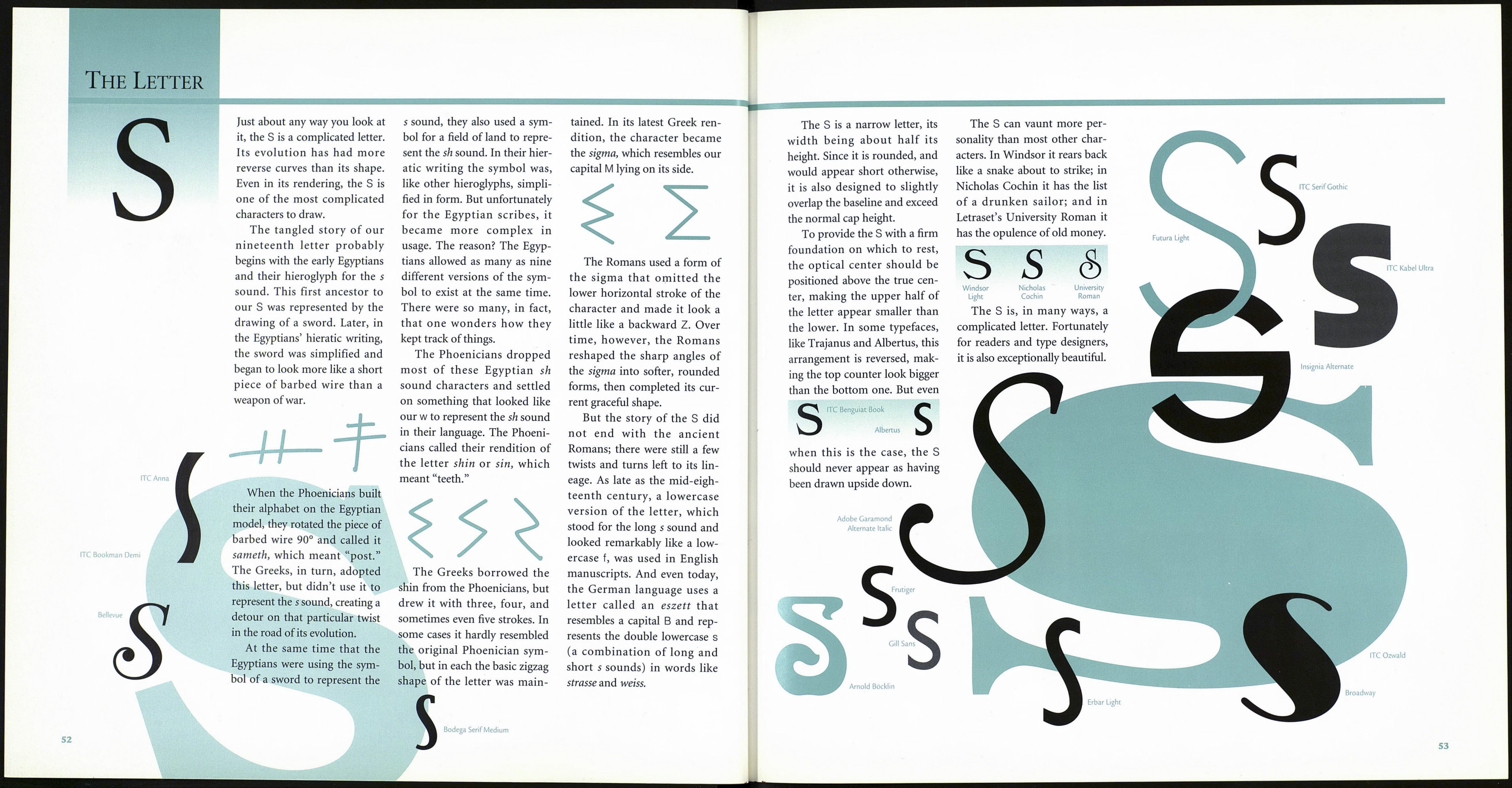
The Letter
Avenir 45 Book
Futura Light
The Phoenician
sign for the r sound,
the resh, bore no re¬
semblance to the
Egyptian ro. The
word “resh” meant
“head” in Phoenician, and was
represented in their alphabet
by what is assumed to be a very
simple rendering of a human
profile facing left.
By 900 B.C. the
Greeks had adapted
the Phoenician let¬
ter and renamed it
rho. They reversed
the orientation of
the head's profile—a step in the
right direction toward creating
our R—and converted the curve
of the face into an angular form
—clearly a step in the wrong
direction as far as the Rv
tionary progress was con
The R evolved further in the
hands of the Greeks, and ended
up looking very much like our
PP. However, the char¬
acter that served as the
basis for the Roman R
was derived from an
earlier western Greek
letterform to which a
short, oblique appendage had
been added under the bowl.
Seeing a good thing in this dif¬
ferentiation between the R and
the P, the Romans lengthened
the short stroke into a graceful
and delicately curved tail that
enhanced the letter as never
before.
The letter R can be one of the
most difficult characters for
type designers to create. When
designed judiciously, it is rich
with subtle details and delicate
proportions. The problem is
that the R is a more exception¬
al character than it seems to be
at first glance. It is not a P with
a tail or a modified B. It is
unique among letterforms.
The Egyptian hieroglyph on
the Rosetta Stone representing
the consonant sound of r was
known as ro and was drawn in
the shape of a mouth. In hierat¬
ic writing the symbol was mod¬
ified slightly so that it looked
more like a headache capsule.
Medici Script
Frederic Goudy thought the
R to be the most interesting of
the Trajan letters. The R can
certainly test a designer’s met¬
tle, but when rendered with
skill it can be an extraordinarily
beautiful communication tool.
The R can vary in propor¬
tion from narrow to medium
width. Its bowl is neither the
same size nor the same shape as
those of the P and the B. The
lower contour of the bowl is
almost horizontal, while the top
contour swells upward. The R’s
tail can begin at virtually any
place along the lower contour
of the bowl, and conclude in a
variety of ways: in a tapered
point, as in ITC Barcelona;
curved like the front of a ski, as
in Goudy Old Style; or in a dis¬
crete serif, like that in Fairfield.
R R R
Berling Goudy Old Style Sabon
In many modern typefaces,
such as ITC Fenice, the tail of
the R ends at the baseline and
terminates in a serif.
Bembo
Bauer Bodoni
Erbar Light Condensed
L
Optima
Letraset
Follies
Frutiger Ultra
ITC Tiffany Demi
Clarendon
R
Helvetica
ITC Fenice
Bodega Sans
51
