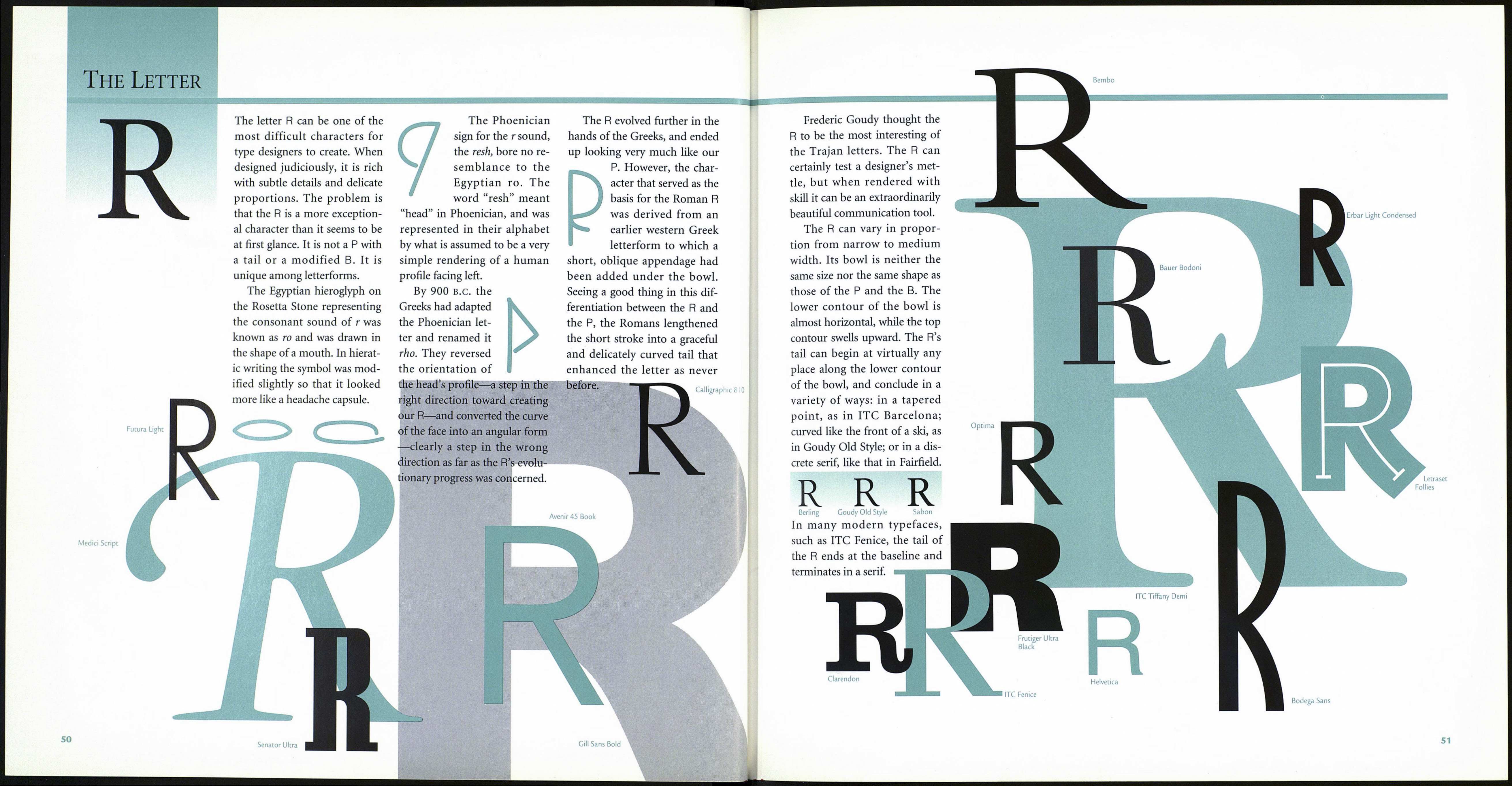
The Letter
Q
Charlemagne
Letraset Heliocype
HH Щ
Type designers walk a pretty
narrow path in their work. The
letters of our alphabet provide
little room for much self-
expression when it comes to
their defined shapes. The more
deeply a designer’s “thumb¬
print” is left on a typeface (in
other words, the more distinc¬
tive it is), the less likely it is to
perform well as a communica¬
tion tool.
Fortunately for type design¬
ers, there are a few exceptions to
the rules of type design ano¬
nymity. The tails of Rs, italic fs,
the descenders of ys, and, of
course, ampersands have always
provided possibilities for artistic
expression to creep into other¬
wise staid typeface designs. The
Q is another character that
permits a certain amount of
designer personalization, some¬
times even to the point of flam¬
boyance. For just about as long
as títere have been Qs, designers
have felt free to have a little fun
with' the letter’s tail. Perhaps
there is even some vague corre¬
lation between the opportunity
to introduce some playfulness
into a type design and the fact
that the original ancestor of our
Q was called qoph, a Phoenician
word meaning “monkey^
Adobe Caslon
Most historians believe that
the qoph, which was also
known as gogh, originated in
the Phoenician alphabet, with
no connection to previous
written forms. Historians also
believe that the qoph’s shape
was based on the rear view of a
person’s head, with its straight
tail depicting the neck or
throat. This interpretation is
feasible, but if you consider
that the word “qoph” meant
“monkey” then perhaps the
round part of the symbol rep¬
resents another kind of “back¬
side,” and what we refer to
today as the “tail” of the Q real¬
ly started out as just that.
The qoph expressed an
emphatic guttural sound not
found in English, nor in any
other Indo-European language.
Although they found the sound
it represented difficult to pro¬
nounce, the Greeks adopted the
qoph, changing its name slight¬
ly to koppa. In addition, they
modified its design somewhat
by stopping the tail at the cir¬
cumference of the circle. Coin¬
cidentally, the koppa represent¬
ed virtually the same sound as
the kappa, another Greek letter.
One had to go, and the koppa
was ultimately the loser, per¬
haps because it had begun to
look like yet another Greek let¬
ter, the rho.
The Etruscans apparently
could live with the somewhat
redundant nature of the koppa,
and continued to use the letter.
In fact, they had not only one
but two other к-sound letters
to contend with. The Romans
elected to use all three when
they adopted much of the
Etruscan alphabet. The first
Roman Q had the Etruscan ver¬
tical tail, but over time it
evolved into the graceful,
curved shape that blends with
the u that usually follows it.
Avenir 45 Book
Künstler Script
Black
Duc De Berry
ITC Benguiat Book
Is our Q nothing more than
an О with the simple addition
of a tail? Yes—and no.
Yes, the basic character is
exactly an 0, but the design
and placement of the tail is no
simple matter. If it is too small,
the character can be mislead¬
ing, especially in text copy.
However, if the tail is too large
or elaborate, it might call
undue attention to itself. Place¬
ment of the tail is also crucial
because it should facilitate the
left-to-right flow of the eye in
reading, not put a roadblock in
the way.
The tail of the Q can be a
tiny appendage, like the one
found in ITC Weidemann; a
free-spirited flourish, like the
one found in most Baskerville
designs; or anything in between.
Q
ITC Weidemann
Baskerville
Some Q tails have terminals,
presenting the designer with yet
another opportunity for free¬
dom of expression. The Q’s ter¬
minal can curl up, as it does in
ITC Lubalin Graph, or turn
down, as in ITC Zapf Book.
ITC Lubalin
Graph
ITC Zapf
Book
Sometimes, as in designs such
as Cartier or Cochin, the tail is
isolated from the rest of the let¬
ter. Regardless of the style of tail
that is chosen, the designer
should avoid positioning its
heaviest part at, or close to, the
swell of the O’s curve. The good
news is that it is possible to
devise many variations on the
Q’s tail without interfering with
its basic function.
Berthold City
New Century
Schoolbook
Bodom Poster
Compressed
Cochin
TC Anna
ITC Avant Garde
Gothic Extra Light
ITC Bookman Light
Blackoak
49
