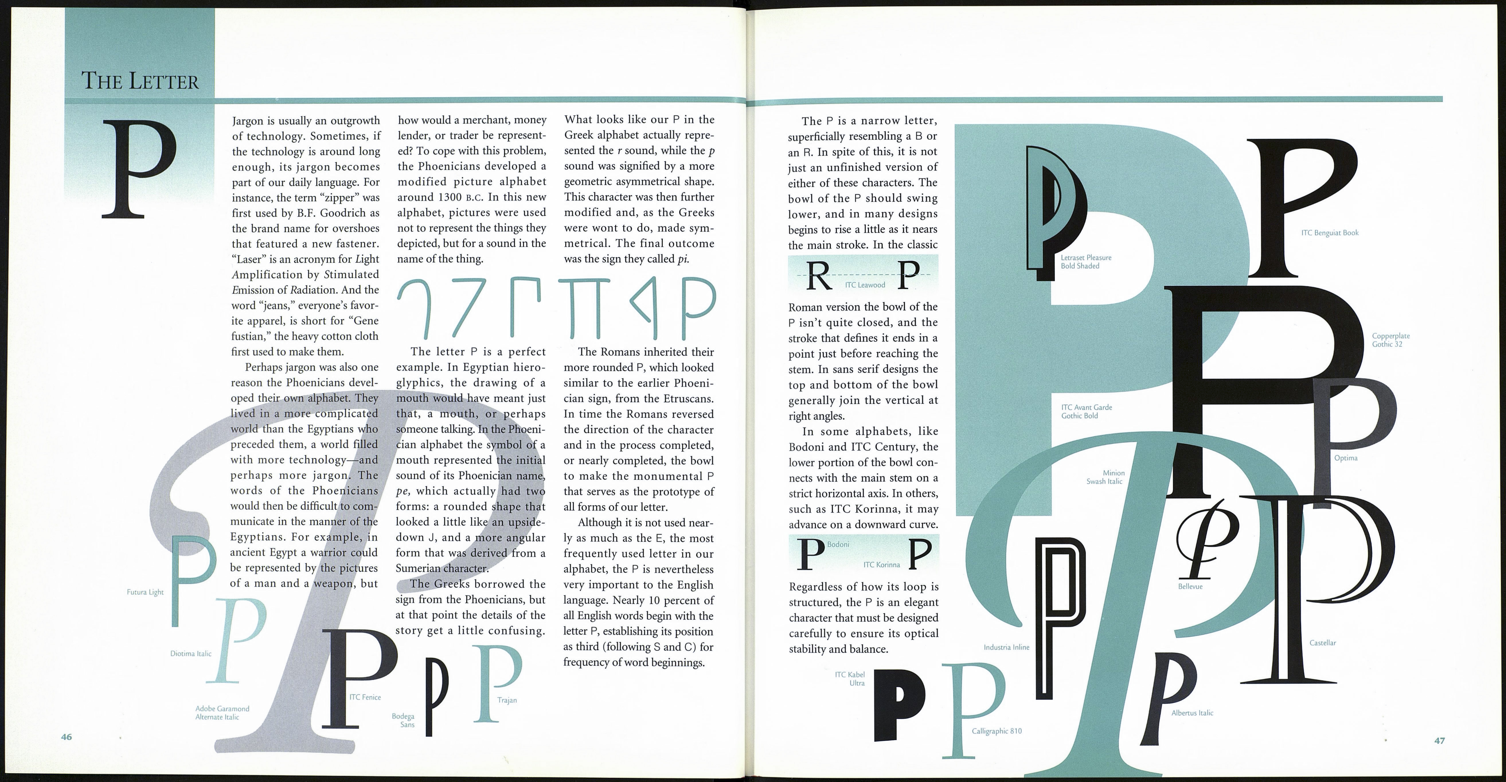
The Letter
тзшшяЕтт
Bauer Bodoni
Some scholars believe that our
current 0 evolved from the
Phoenician ayin, a symbol used
over two thousand years ago.
Others contend that a 5000-
year-old Egyptian hieroglyph
depicting a knotted cord was
the first use of what
was to become the
fifteenth letter of our '
alphabet. Rudyard
Kipling, however, dates the
conception of the О even far¬
ther back in history. In his Just
So Stories, he tells how a Neo¬
lithic tribesman and his preco¬
cious daughter invented the
alphabet.
1 cord was
ft
According to Kipling, the О
was the third letter of the alpha¬
bet to be devised by those
designers of the distant past.
They had just finished the A
and the Y (the head and tail,
respectively, of a carp) when the
girl asked her father to make
another sound that she could
perhaps translate into a picture.
“Oh!” cried out the father.
“That’s quite easy,” said the
daughter. “You make your
mouth all around like an egg
or a stone. So an egg or a stone
will do for that.”
“You can’t always find eggs
or stones,” said the father.
“We’ll have to scratch a round
something like one,” and he
drew the first O.
ITC Avant Garde
Gothic Book
Bodega Sans
Futura
Extra Bold
ITC Ozwald
Actually, the О probably did
start out as a drawing of some¬
thing, but not a stone, an egg,
nor even a knotted cord. The
true ancestor of our О was
probably the symbol for an eye,
complete with a center dot for
the pupil. The ayin (pro¬
nounced EYE-in, which meant
“eye”) appeared among the
Phoenician and other Semitic
alphabets around 1000 b.c.
ООО
When the Greeks were
exposed to the ayin, they
adapted it to their communica¬
tion system and assigned it to
represent the short о sound.
They also changed the name of
the letter to omicron. The
omega is another Greek O-let-
ter, which they used to repre¬
sent the long о sound.
While the Phoenicians and
the Greeks drew the letter as a
true (or nearly perfect) circle,
the Romans compressed its
shape slightly to make it con¬
sistent with their other monu¬
mental capitals.
Caslon
Open Face
The stroke weight of all Os,
even those of the sans serif
variety, thins slightly at the top
and bottom of the character.
This is almost imperceptible in
typefaces like ITC Avant Garde
Gothic, while in designs like
Bodoni or ITC Fenice it is
quite dramatic. In most type
designs, the part of the stroke
at the top of the О is also slight¬
ly thinner than the part at the
bottom. This is done to give
the letter an optically strong
foundation.
О ITC Avant Garde
Gothic Bold
Bodoni
The stroke weight of the
Roman monumental О is heav¬
iest at approximately two and
eight o’clock. This tilted axis
reflects that the letters were
first drawn with a flat-nibbed
pen or flat brush, the swelling
stroke of the broad brush creat¬
ing gradated thick and thin
curves as it traced the character.
O Bembo
Baskerville
Over time, as type designers
reinterpreted the O’s basic
shape, its thickest part shifted
to a more horizontal position.
The letter О can be perfectly
round, as found in Futura and
Schneidler Old Style; con¬
densed, like those in Erbar and
Torino; egg-shaped, like the О
in Revue; or even slightly
square, like the Os found in
Melior and Eurostile.
OOOO
Futura Erbar Revue Eurostile
The О is one of the “control
characters” in a typeface,
through which the designer
establishes many of the design
parameters for the rest of the
face. It sets the standard for the
round capitals’ stroke weight,
top and bottom hairline
weights, and spacing and width
proportions, as well as the
width of the bowl stroke rela¬
tive to vertical strokes.
One of the fundamental
rules of handlettering and
typeface design is that round
strokes are always heavier than
straight verticals. The degree to
which this rule is carried out
depends on the individual
typeface and the sensibilities of
the designer. It should not be
readily apparent, however, that
curved strokes are heavier than
straight ones.
О
о
