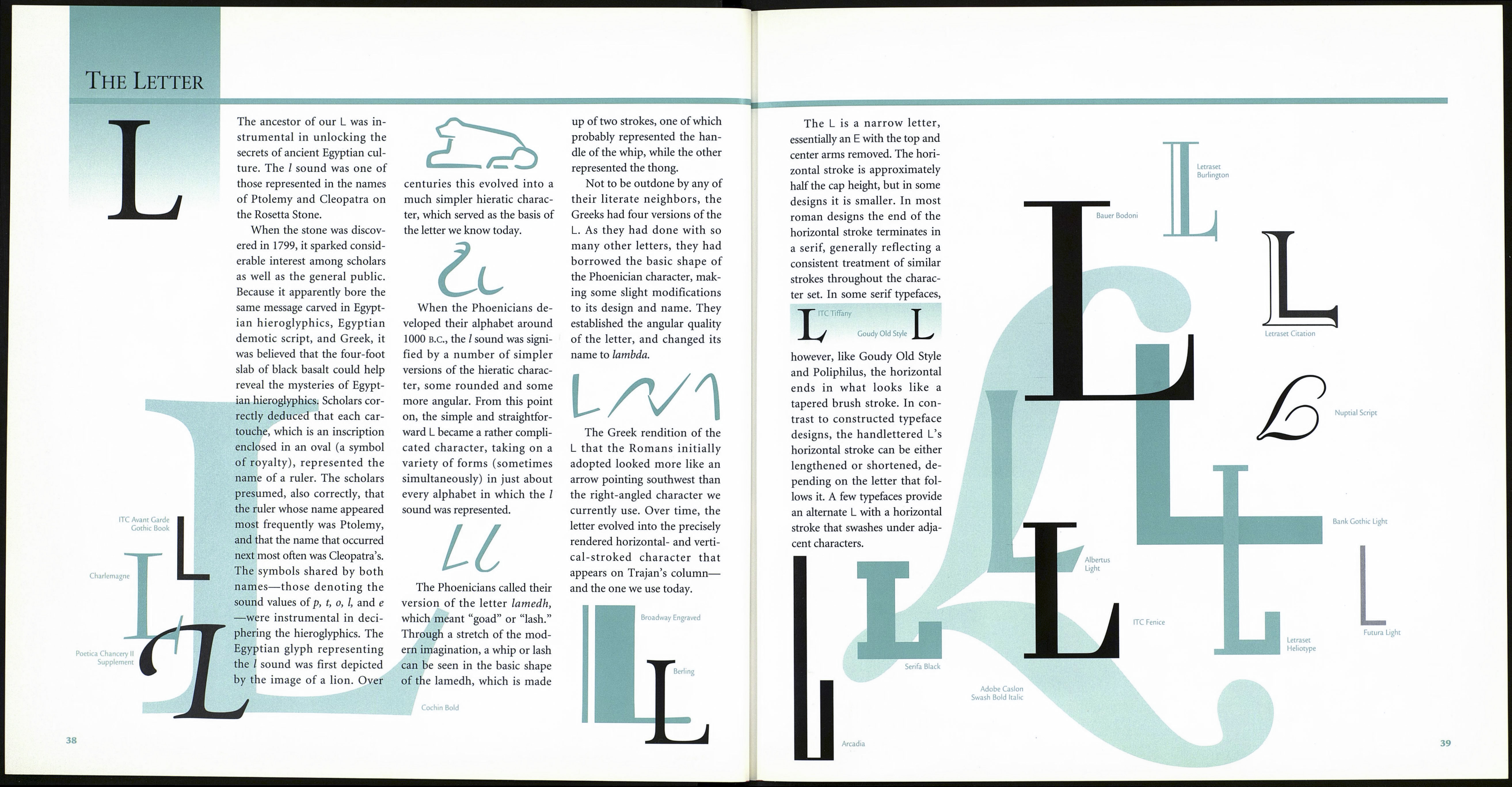
The Letter
Adobe Caslon
Swash Italic
Bellevue
Some letters seem to be slaves
to fashion, continually chang¬
ing their images to suit new
writing utensils or languages.
The F is a prime example, the
typographic equivalent of a
clotheshorse, swapping flow¬
ered shirts, bell-bottoms, and
three-piece suits for paisley
ties, splayed collars, and double-
breasted jackets. In contrast,
the К is a paragon of conser¬
vatism, virtually always seen in
wing-tip shoes and button-
down collars.
The К was the eleventh
character in the ancient Semitic
alphabet, a position it has
retained to this day in our cur¬
rent character set. It has also
probably varied less in form
than any other character. The
forerunner of our K, the Semitic
sign kaph was a three-stroked
character that represented the
palm of an outstretched hand.
The Semitic tribes of 1000 B.C.
practiced palmistry, so it is not
surprising that they chose such
a symbol to represent one of
their phonetic sounds.
Several versions of the kaph
were used by the Semites, par¬
ticularly by the Phoenicians,
but all were composed of three
strokes drawn in a similar fash-
The Greeks adopted the lat¬
est version of the kaph and
introduced symmetry into its
design, eventually turning it
around so that the diagonals
К
ion. The first version was a
simplified drawing of a right
hand, the next looked some¬
thing lil^e our Y with a short
middle stroke between the two
longer diagonals, and the last,
whose form was reduced even
further, was turned on its axis
so that its two diagonals point¬
ed left, much like a backward
version pf our K. Although the
character was modified and
reoriented in each of these evo¬
lutionary steps, its basic form
remained very much the same.
Cloister
faced right. The Greeks even
kept the basic name of the let¬
ter, changing it (barely) to
kappa. In the Greek language,
two signs were used to repre¬
sent the к sound: the kappa
and the koppa (the predecessor
of our Q). The Etruscans, how¬
ever, had three signs for the
same sound: the C, which was
employed before the e and the i
sounds; the K, which was used
before an a; and the Q, which
always preceded a u. The early
Romans adopted all three, but
in time dropped the K, using it
only in adopted Greek words,
or in those of an official nature.
The latter use was probably the
reason the К appeared in the
Roman monumental inscrip¬
tions, which set the standard
for our current design.
Formata
Condensed Light
Futura Extra Bold
ITC Berkeley
Oldstyle Book
ITC
Korinna
Bold
with the upper considerably
above the midpoint, giving the
letter a high-waisted appear¬
ance. ITC Benguiat is a prime
example of this form of K. To
provide the character with a
firm base on which to stand,
the lower diagonal should
extend slightly beyond the
upper.
K Univers
ITC Benguiat Book m.
There are a few characters
in our alphabet that give the
type designer an opportunity
to add a flourish or touch of
personality to the basic form.
The Q and the & are ideal for
this, as is the K, if only to a
slightly lesser degree. Often the
K’s lower diagonal is suffused
with a little more energy than
is generally apparent in similar
strokes in other characters.
Berthold City
Berthold Script
ITC Serif Gothic
V
№41 Senator Demi
The К is normally somewhat
narrower than it is high, usually
a little over half as wide. While
the К is a relatively straightfor¬
ward letter to render by hand
and requires no optical “tricks,”
type designers must give some
consideration as to how and
where its two diagonals join,
ensuring that the junction of
the three strokes does not cre¬
ate an optical dark spot. Gener¬
ally the diagonals meet at the
main vertical’s midpoint, or
slightly higher. In stonecutting
the juncture of these two
strokes remains simple, and
occurs at the optical midpoint
of the vertical. The К in Univers
is an excellent example of this
approach as applied to modern
type design. In designs where
the letter is obviously con¬
structed (as opposed to being
calligraphic), the thin upward
stroke aligns well below the
true center of the vertical, and
the heavier downstroke origi¬
nates above it, from a point on
the lighter diagonal. Sometimes
the lower diagonal connects
ITC Mona
Lisa Solid
37
ITC Tiffany
