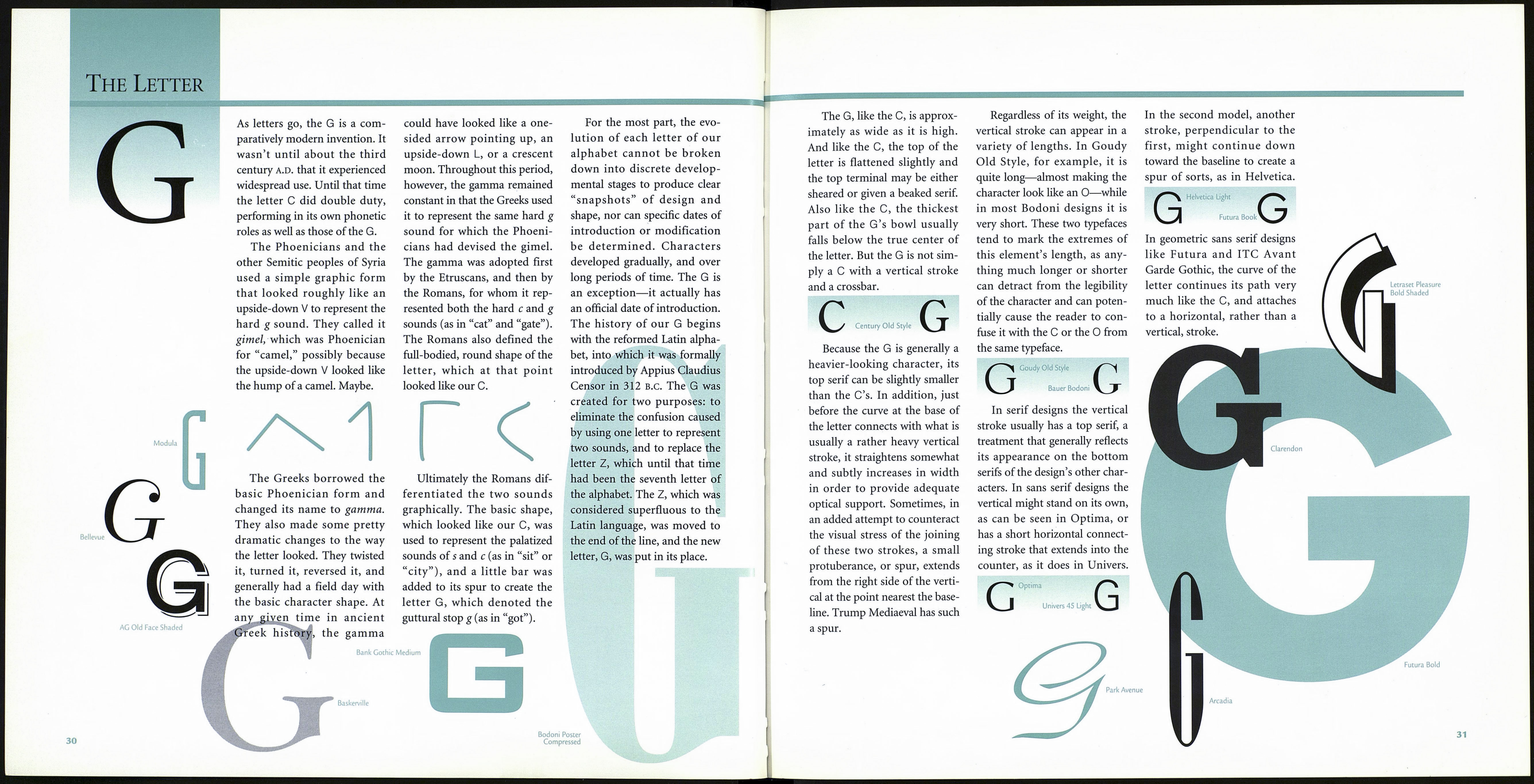
The Letter
Adobe Garamond Italic
F
шШкшт Bembo
Formata
Our present-day F had a diffi¬
cult childhood. Before matur¬
ing as the solid citizen of the
Latin alphabet, it held many
jobs and appeared in public in a
variety of costumes. The F even
“dropped out” for an extended
period to hold a position in a
counterculture alphabet.
In its earliest years, our F was
disguised as a snake—actually, a
horned snake, or something
that vaguely resembled a sea-
serpent. This was around 3000
B.C., when it served as the
Egyptian hieroglyph cerastes.
Not entirely happy with this
image, the F began to change its
character through the process
of simplification. Eventually it
lost all resemblance to a crea¬
ture of any kind, and was little
more than a squiggle with a
topknot. Still dissatisfied, the F
continued to simplify itself. In
fact, by the time it emerged as
an Egyptian hieratic form it was
nothing more than an almost
vertical stroke capped by a
small crossbar. With only a
slight stretch of the imagina¬
tion, it could be said to look
like a nail.
Which may be why the
Phoenicians called it waw,
which means “nail” or “hook,”
when they adapted the symbol
into their alphabet. In its new
job as a waw, the character rep¬
resented a semiconsonant
sound, roughly pronounced as
the w in the word “know.” The
trouble was that, at various
times, the waw also represent¬
ed the V sound, and sometimes
even the и sound.
But the F was still a problem
child. Because ancient Greece
was made up of many auto¬
nomous city-states that used
the same basic alphabet to con¬
struct an almost equal number
of dialects, the F (and several
other letters, for that matter)
was used for a variety of pur¬
poses. In 400 B.C. one alphabet
was officially adopted in
Athens and was subsequently
used throughout Greece. The
digamma was not a member of
the surviving alphabet.
Luckily, the digamma was
able to find useful work in the
Etruscan language, where it
When the Greeks assimi¬
lated much of the Phoenician
alphabet, they handled the
waw in a typically Greek-and
very logical-manner. They split
it into two characters: one rep¬
resenting the w, and the other
became the forerunner of our
v. The w sound became the
Greek digamma, or double
gamma, which was constructed
by placing one gamma on top
of another.
provided yeoman service until
the Romans adopted it as a
symbol for the softened v, or
“double v” sound. Even today
the German language (an
important source for English)
still expresses the v as an /
sound, in such words as vater
(“father” in English; pro¬
nounced FAH-ter). Finally, the
sensuous horned snake found a
permanent home as the very
geometric sixth letter of the
Latin alphabet.
28
Cooper Black
The F is about half the
width of the M, and its center
arm, which is normally just
slightly shorter than the top
one, is usually positioned a lit¬
tle above the mathematical
center of the character’s height.
While it is true that the
design of the F is very similar
to that of the E, one should not
presume the F to be an E with
its bottom stroke missing. In
spite of its unmistakable re¬
semblance to the E, the F pre¬
sents a problem to type design¬
ers that is not present in the E:
It is asymmetrical—top-heavy,
in fact. As a result, designers
very often incorporate a few
subtle yet essential characteris¬
tics into the F that distinguish
it from its three-armed alpha¬
betical precedent. For instance,
sometimes the center arm of
the F is slightly shorter or
placed a little lower than its
counterpart in the E. Occa-
E
ITC Stone Sans
F
sionally in serif designs the
base of the vertical stroke
exhibits a slight flair, where the
same feature in the E might
only end in a taper.
Blackoak
Lunatix Light
Ponderosa
Barmeno Extra Bold
Monotype Onyx
Italic
Adobe Caslon Swash Italic
ITC Anna
Bovine Poster
29
