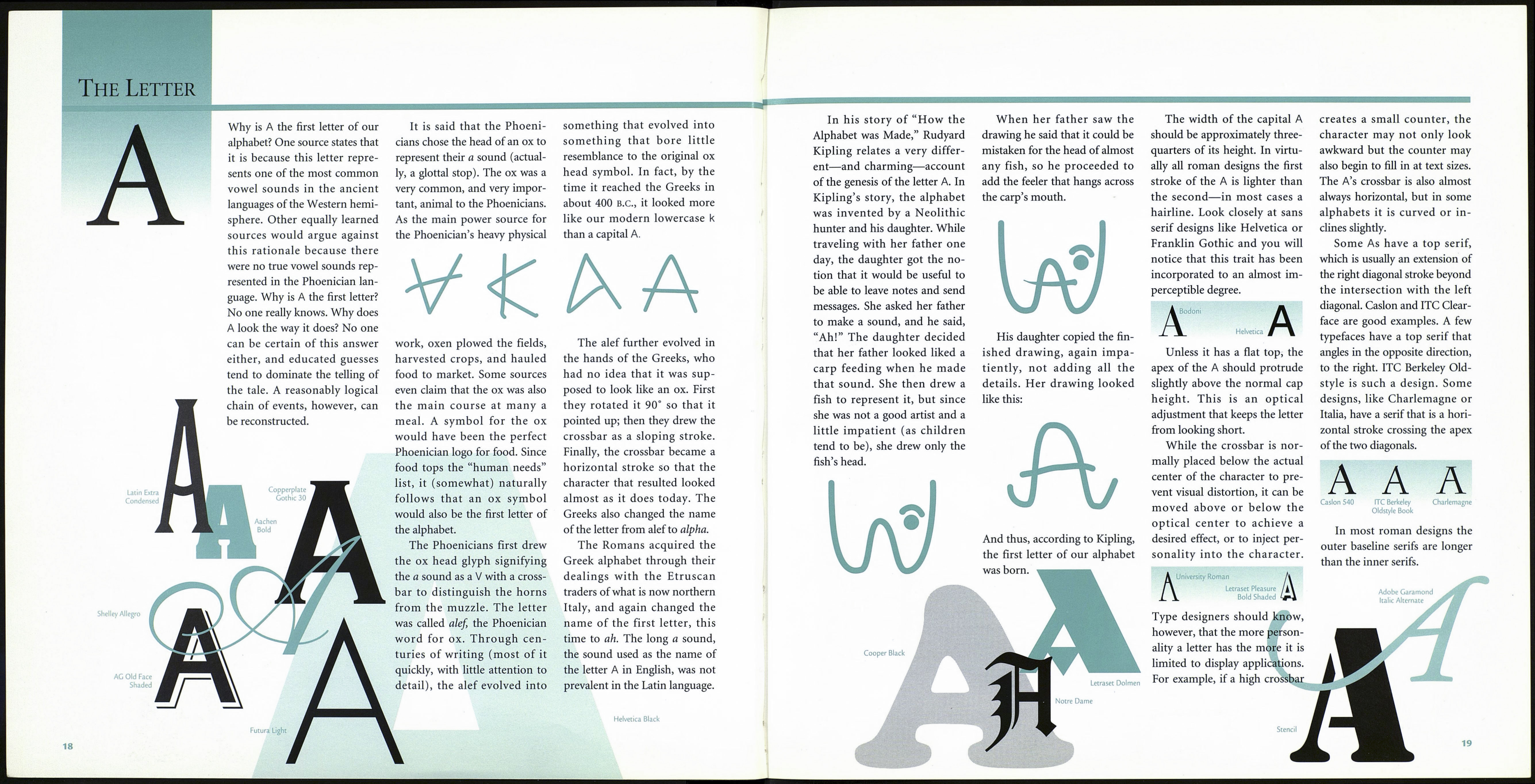
The Capital Letters
It began quite simply. The precursors of
the first attempts at writing consisted of
simple tokens: a flower left outside some¬
one’s hut to express a tender message, or a
pile of rocks along a trail to warn of dan¬
ger. Slowly, these tokens and signs evolved
into marks. The marks that began the
enterprise of writing had to be easily
understood, well designed, and sufficiently
recognizable so that they could be linked
to the same meaning again and again.
From its conception, writing was an art.
The first graphic images were generally
very simple shapes that represented a
rather basic vocabulary: man, woman, fire,
food, tree, shelter, and other fundamental
things and ideas. Gradually, more symbols
were needed to express more words and
concepts, so, for example, a number of
“tree” symbols were unified to make a
“forest,” or the symbols for man, woman,
and child were consolidated into a single
“family” symbol.
The difficulty of writing with symbols is
plain: It takes too many symbols to express
complicated and sophisticated language.
As human culture and society became
increasingly complex, propelled by the
mechanisms of agriculture, religion, and
politics, graphic forms of expression were
developed to respond to their demands.
Earlier symbol writing referred to specific
things or ideas, making it inadequate for
expressing abstractions, keeping records,
or creating documents. To surmount these
obstacles, new writing systems required a
reduction in form as well as an expansion
of meaning.
The Egyptians were probably the first to
develop an elaborate system of symbol writ¬
ing, which later became known as hiero¬
glyphics (Greek for “sacred writing”). They
began by using pictures to represent words
and syllables with the same or similar sound
(rebus writing). Over thousands of years
they gradually began to use pictures to rep¬
resent syllables (phonograms, or sound pic¬
tures), which they strung together to create
words. In time they created hieratic and
demotic scripts, simpler forms of writing
that were used for religious and commercial
documents. This set the stage for the cre¬
ation of alphabets throughout the nation¬
states encircling the Mediterranean.
The next evolutionary step was brought
about by the Phoenicians, the forerunners
of modern entrepreneurs. They clearly
had a need for an alphabet, but not for the
graceful, decorative alphabet of the Egyp¬
tians. The Phoenicians were concerned
with record keeping, and little else. As a
result, Phoenician writing was free of frills,
easy to read, and quick to write. Phoeni¬
cian writing was also purely alphabetic—
each character corresponded to one
sound. Through the process of doing busi¬
ness in Greece, the Phoenicians also
passed on their alphabet. Once again our
alphabet’s distant ancestor changed—the
Greeks added vowels, new characters, and
attractive curves—and its beauty began to
take shape.
The Latin alphabet was derived from
Greek letterforms by way of the Etruscans,
a people indigenous to the Italian peninsu¬
la. The Romans adopted and adjusted the
Greek alphabet in the same confident way
they adopted and adjusted to the rituals of
the Greek gods, by developing their own
style and characters based on the Greek
foundation.
The Roman capital letters are the formal
letterforms that were carved into monu¬
ments and buildings and used for impor¬
tant manuscripts. Although they were
carved in stone, the Roman capitals reflect
the same principles as handwritten letters.
Our typefaces possess curves and have thick
and thin stroke gradations because the
structures of their Roman forebears were
based on the forms created with flat-nibbed
pens. The Roman capitals have had, and
still have, the greatest influence on the
design and use of capital letters, enduring
as the standard of proportion and dignity
for almost two thousand years.
Until about A.D. 800, changes in our
alphabet were both gradual and evolution¬
ary. There were no clear-cut lines of demar¬
cation in design development. This changed
when Charlemagne ascended the throne of
the Holy Roman Empire in 771. Charle¬
magne undertooka far-reaching revival of
learning and civic betterment. One of the
results of this heroic undertaking was the
development of a consistent writing style.
The Caroline minuscules, as they have come
to be known, were the prototypes of our
own modern small letters. They are impor¬
tant not only because they are a permanent
manifestation of genius, but because they
furnished models for lowercase printing
types used to this day.
These two standards, the Roman capitals
and the small letters that evolved from the
Caroline minuscules, provided the basis for
letterforms when movable type was invent¬
ed by Johann Gutenberg. As the Renais¬
sance unfolded, Griffo, Jensen, and Gara¬
mond used them as models in the fifteenth
and sixteenth centuries. This standard was
maintained in the eighteenth century in the
work of John Baskerville, and has continued
well into the twentieth, with the type
designs of Frederick Goudy, Hermann Zapf,
and Matthew Carter. Although attempts
have been made to tamper with letterform
designs—to condense them or expand
them, to equalize their varying widths, to
electronically change their proportions—
the consequences have not replaced the
design principles set by the Romans and
affirmed by their successors. They have
become the quintessential melding of art
and information.
